Thank you! Your LEON news are on their way.
Sustainable companies create lasting bonds with the people who interact with them. They do this by clearly articulating the mission that drives the company at its core, and the goal that it commits to.
At LEON, our big hairy audacious goal is to super-power people inside of companies rather than companies themselves. Not because we don’t care about the companies but because if we focus on improving the humans inside of them, the companies will naturally become better as a side-effect.
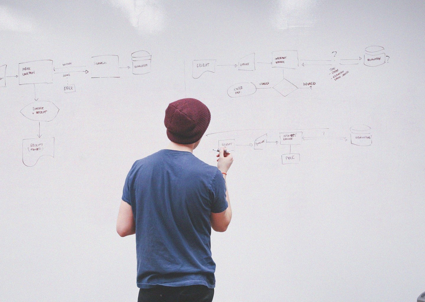
Over 6 moths ago, we started thinking about how we could express this goal in a more open and clear way and today we're taking that the first big step by rolling out our new brand identity on the website. This brand identity is more than a makeover – we believe it is a more real representation of who we are as a company.
So what did we change?
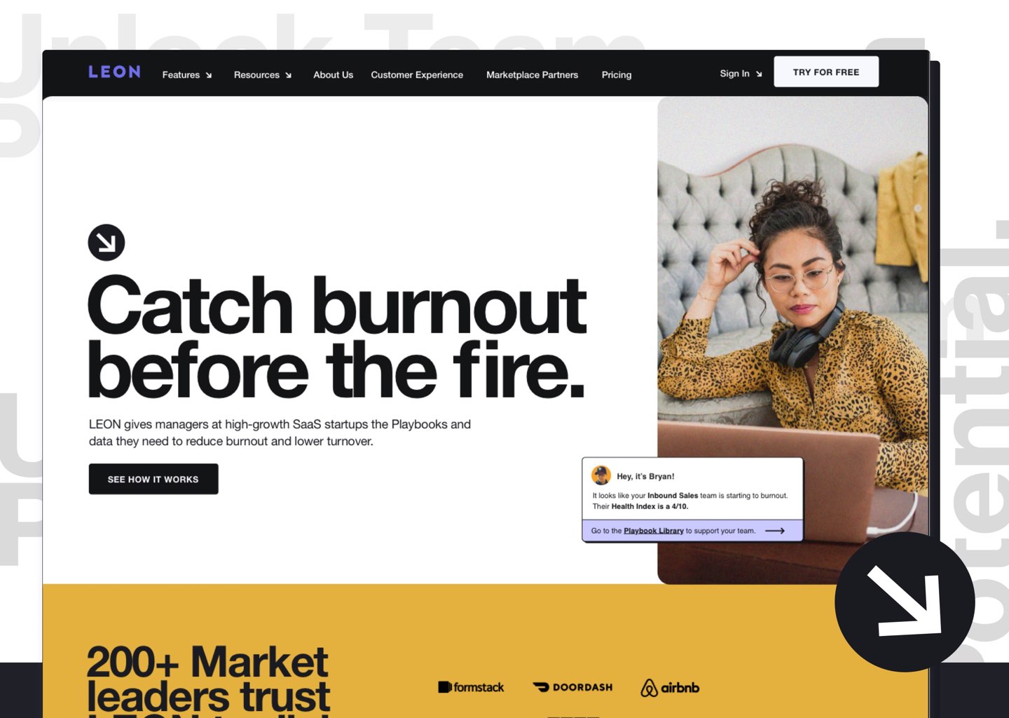
On every page you see, we clearly understood that helping people understand exactly what LEON does, the problem we solve, and how we do it, was necessary for our users and clients.
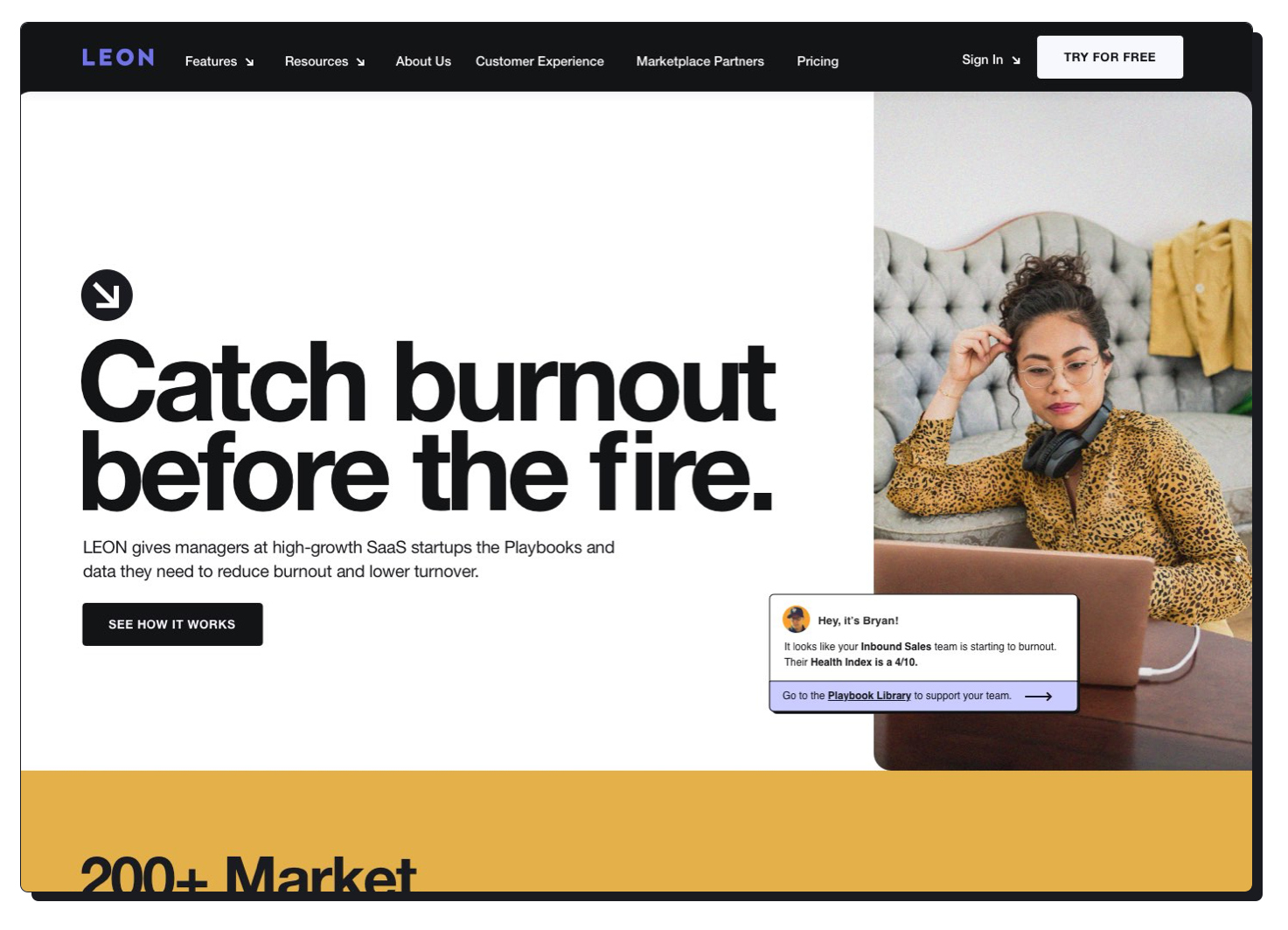
Through our use of short and concise copy, and easy to read font updates, our hope was that every single person who visits our site should walk away with a better understanding of how LEON can best help solve their problem.
And for the folks who happened to love the tone and take no prisoners approach to our copy, we made sure to make take care of you too.
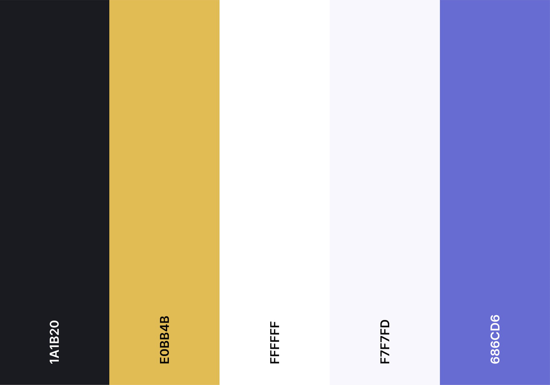
The other thing you’ll notice on the website is the new brand color: gold (or as we like to call it "performance gold"). The gold and our new secondary colors make up a cool, almost fashion forward, confident color palette that is designed to make a statement.
Some might say that our new colors are toned down– but we believe it’s better to invoke a feeling with color, vs beating you over the head with it.
LEON has always been human first. I mean hell, our first blog ever was titled HUMAN [capital]. That's why you'll notice that on every page, post and blog, we made sure to always lead with humans like you and me.
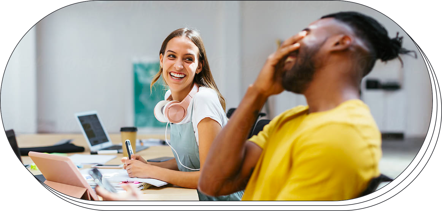
We went for a natural, yet hip portrait style with grainy, almost abstract treatment. With this style, the humans we feature provide both diversity and happiness, but at the same time, a bit of a rough around the edges type feel, humans present. As always, being inclusive and honest was always at the forefront.
These are a few of the broad changes that we launched today. A blog post cannot possibly capture the hard work involved in bringing a new brand to life, and the shear amount of work the LEON team put into this. We hope you enjoy the new LEON as much as we do.
But I digress.
.png)
.png)